Why this change of visual identity?
First of all, because our environment has drastically changed in recent years.
The world of work has been revolutionized by unprecedented changes.
On the one hand, large companies have entered a new era, with a galloping digitalization of their processes and a generalization of telecommuting, accelerated by the Covid crisis. They have also changed the way they look at skills management, in a context of war for talent that is pushing them to turn to external resources.
On the other hand, freelancers and small innovative service companies have grown considerably. Their number has multiplied in a few years and more and more companies are calling on their services. Their desire for flexibility and freedom is growing stronger than ever.
In this context, we at LittleBig Connection have also strongly evolved.
Our expansion has made us go from a French start-up to an international scale-up in just a few years.
With an average growth of 130% per year over the last 4 years, our staff has doubled from 100 to 200 people, and we have accelerated the opening of multiple offices around the world: Spain, Vietnam, Colombia, India, Canada… As we like to say: the sun never sets at LittleBig Connection.
So we have grown, matured. Our services and products have become real references on the market and we are now undeniably recognized as specialists in our field.
Of course, we do not intend to stop there, and we fully assume our ambitions. Our goal is to become the undisputed global leader in talent management, and to reach annual revenues of one billion euros by 2025.
We realized that our visual identity did not sufficiently reflect this new dimension taken by LittleBig Connection. That’s why we decided to rebuild the foundations of our brand, and to revise from A to Z our visual identity, to make our development more concrete, and better carry our commitment.
The foundations of this new identity
Before defining the constituent elements of our new identity, we wanted to (re)define the DNA of our brand.
We first clarified our vision, which has guided our roadmap since the creation of LittleBig Connection: it starts from the observation that the world of work is changing at a lightning speed. We are convinced that companies must not only adapt to these evolutions, but also take the lead by being themselves actors of change. How can they do this? In particular, through an organization based on global talent management, which puts skills at the heart of each project, in order to mobilize the best profiles, at the right time and in the right place.
To achieve this, companies will have no choice but to evolve their structure to work in a totally flexible way with all types of partners, regardless of their status, whether they are internal employees or external service providers.
The mission we have set ourselves since our creation is clear: to create a direct and transparent link between companies and all their external partners, whatever their size (Little or Big), so that they can team up more easily than ever.
Hence our new tagline that sums up this ambition: “Team up with the world
How we translated this identity visually
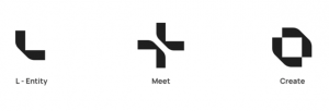
We chose a logo that refers to concepts of meeting and creation.
It represents both the ecosystem of large companies (the Big) and independent experts, freelancers, young innovative service companies (the Little) through an entity symbolized by an L.
The meeting and collaboration between these two entities is then defined by a “plus” sign obtained by putting these 2 entities face to face.
The final shape of the logo refers to the creation of innovative projects, made possible by the simple and transparent link created by LittleBig Connection.
The other elements of our new visual identity complete this concept, with :
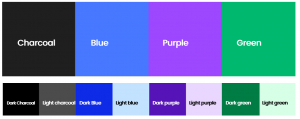
- A color palette with a strong emphasis on blue, which represents the range of opportunities offered by our services to our users, both experts and companies. Our visual identity also integrates other colors (green, charcoal and purple) for a colorful and elegant look.
- A font that expresses the seriousness of our services, without being too strict.
- Finally, the use of photography rather than illustration to embody the eminently human side of our mission.
The result is a visual identity that reflects the LittleBig Connection of today and tomorrow: more stable, more mature, more human.
An innovative and pioneering player in the #Future Of Work.
